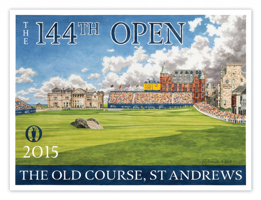
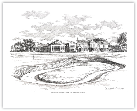
Even if his name doesn’t ring any bells, it is likely that you have seen Lee Wybranski‘s work. While it is his Major Championship posters that have gained him the spotlight in the last decade, I hope you leave this interview with an appreciation for his other work as well. You may have held a Wybranski designed scorecard or longingly stared at one of his logos designed for the top golf clubs… his reach goes well beyond what you may have seen already!
Q: What came first, the golfer or the painter? Tell us a little bit about your background as an artist and a golfer. Did one come before the other?
I was an artist long before I was a golfer and it was my work that brought me to the game. I was doing Pen & Ink architectural drawings after getting my BFA when I received my first commission in golf from Winged Foot Golf Club. Within a few months I had been contracted by several clubs in the MY Met section, including Atlantic GC, Ridgewood CC, and the National Golf Links of America. Soon I was working almost exclusively in golf.

Q: Your name has become synonymous with your Major posters released every year. What is your process in the lead-up to creating each timeless poster?
After discussions with the client about the venue, I typically visit the site 9-12 months in advance to sketch and photograph and gather impressions. From this raw material I will generate 3 rough concepts which I submit to the client. We will then discuss the options and select one to proceed with – nearly always it is the concept that I recommend. Next we will refine the composition over several rounds of revision until we have final approval on the layout, at which point I begin to paint the final artwork. Once the painting is complete we scan it, reformat for printing and go to press.
Q: Is there a golf artist or particular work that drew you to creating golf paintings of your own?
There’s not one artist that drew me to the game but once I started working in golf I began to look around for inspiration and found that golf has a rich history in art and literature. Early influences include Harry Rountree, AB Frost and Tom Purvis. Of my contemporaries I immediately admired the watercolors of Kenneth Reed.
 Q: Readers may not know that you have designed a number of golf-oriented branded works such as Cypress Point’s tree logo, Waterville’s logo, and many US Open logos. How do you strike the balance between classical styling, tradition, and a modern “brand” for the club or event?
Logo and Branding work in golf is very interesting precisely because of the balance that must be struck between traditional appearance and functionality. Much of our design time is devoted to logo renovations in which we take an established and often beloved mark, such as that of Cypress Point and Merion, and re-create it using current technology so the logo works seamlessly across applications. The U.S. Open and other championship logos are a different assignment – here we typically create a more simple and bold, less decorative versions of the club logo, such as Merion’s wicker basket, and add the championship elements. Occasionally we have more creative latitude, such as when the host club does not have a strong mark already, or there is a desire to make a departure.
Q: Some truly great clubs have commissioned work from you. Is there a golf club you haven’t visited that is on the painting bucket list? If so, why that club?
I have a long bucket list – as many great course as I’ve seen there are so many that I haven’t. Royal Melbourne immediately comes to mind as a course I’d love to paint and play. I’ve yet to visit Australia and have always had an interest in the Sandbelt courses there.
I strongly suggest having a look through Lee’s website! Here is a link to his online store, where you can pick up prints, posters, and original works!


